

Timeline
Dec 2022 - Mar 2023
Industry
Fintech
Type
Responsive Web
Role
UI/UX Designer
Team
Users came to browse, but SEVA asked them to calculate. This mismatch created friction, especially for users unfamiliar with how financing worked. SEVA’s IA feature offered fast financing approval, but it was not visible or intuitive enough to build trust or engagement.
“How might we increase lead conversions by offering a seamless car search and financing experience?”

1700% increase in lead conversion


Financing now felt like a support tool, not a barrier


Know Your Audience
SEVA initially grouped users by broad socio-economic factors. We refined these into sharper personas based on car purchase intent and decision readiness:
These personas helped us frame behavioral triggers and tailor the experience based on decision stage.
UX Audit & Research
Workshop & Strategy
We ran a cross-functional workshop to align design, marketing, and product teams on the root issues. Together, we prioritized:
A new sitemap & information architecture to simplify navigation
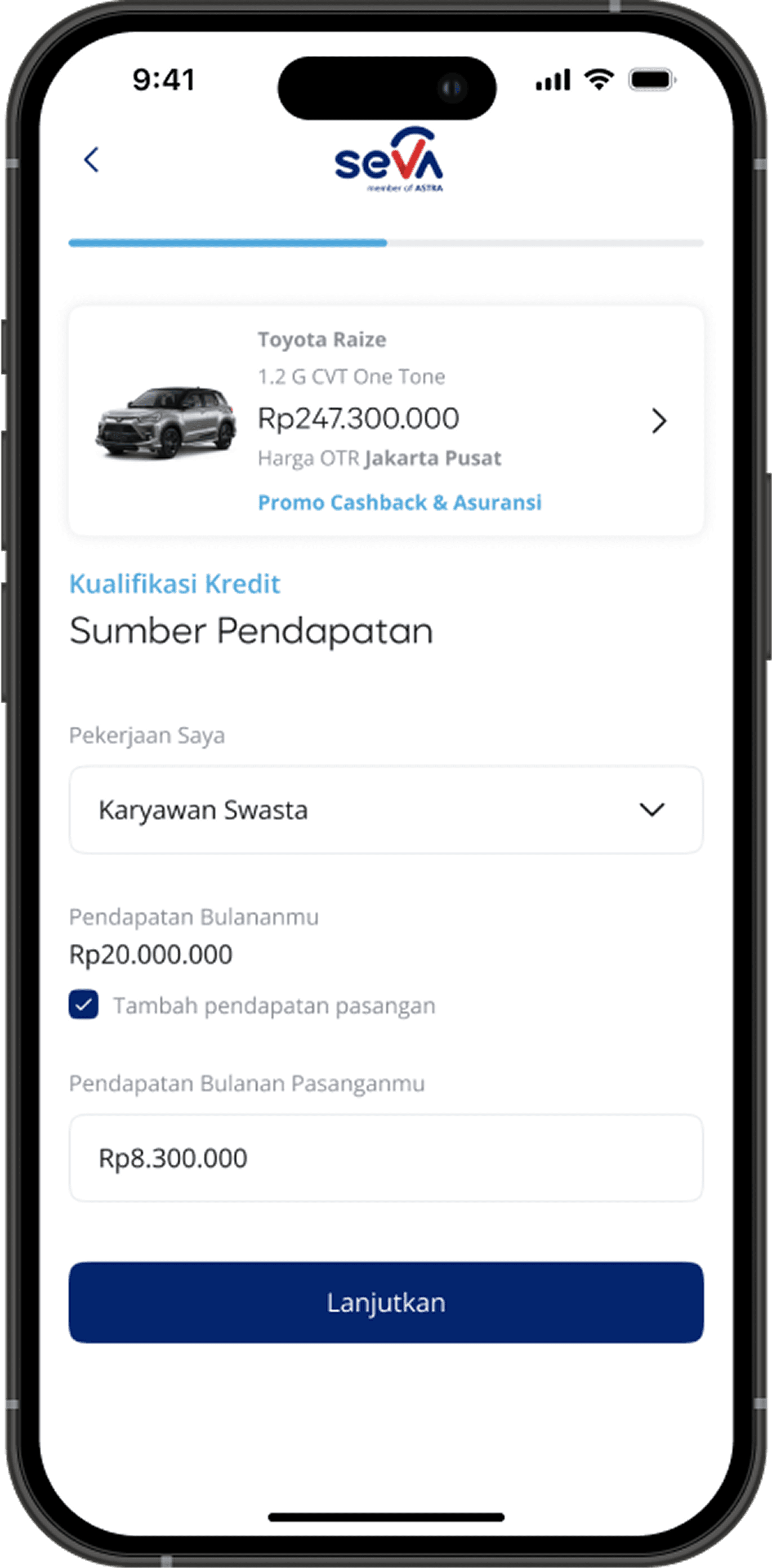
A revamped presentation of the Instant Approval (IA) feature — making its value clearer and more accessible
Design Principles
Our new approach focused on clarity, flexibility, and behavioral alignment:
Seamless & Intuitive – Reduced steps, fewer redirects
Behavior-Aligned – Let users browse first, finance later
Smart Search – Let users filter by car type, price, AND financial fit
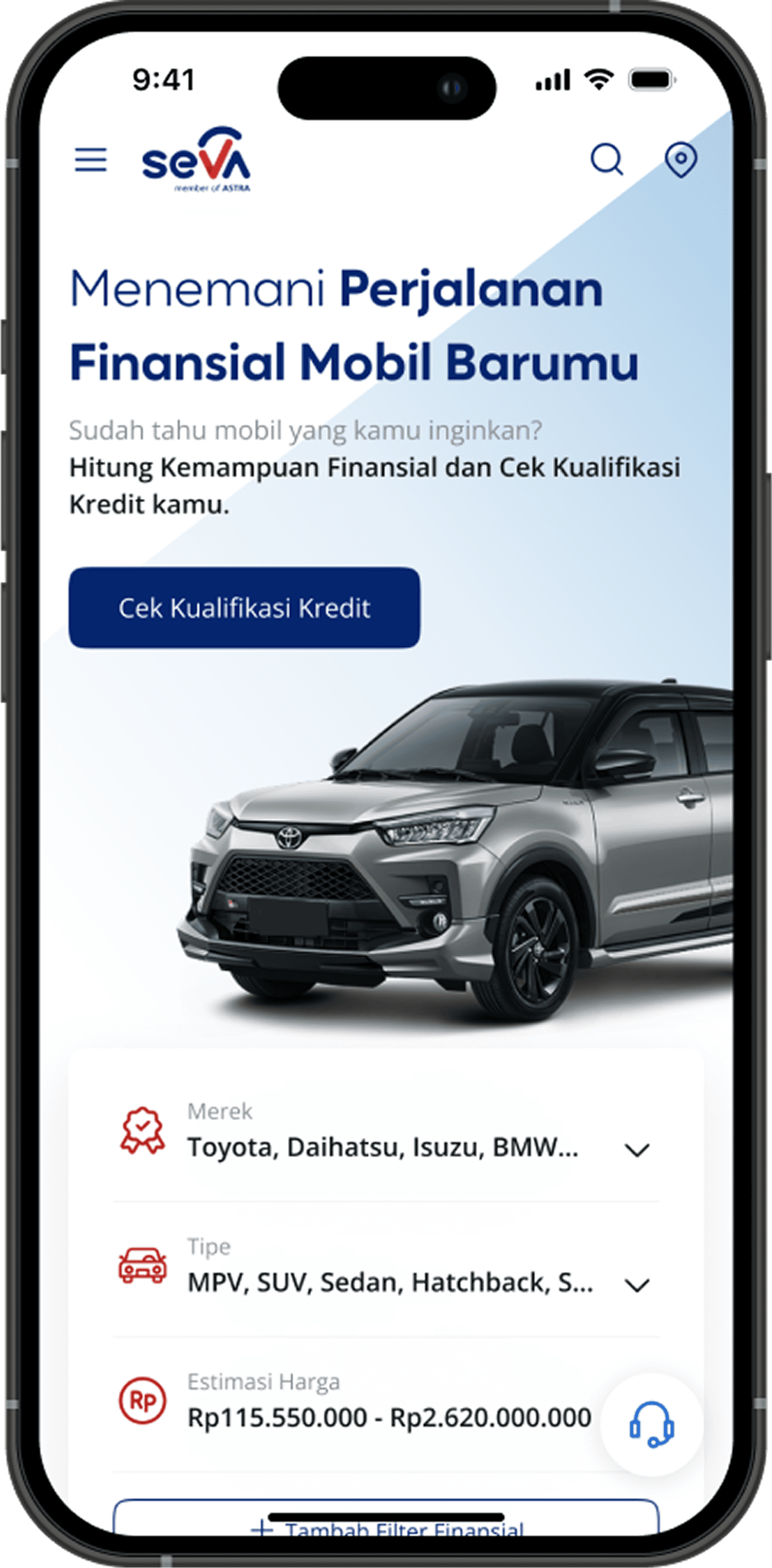
Concept A — Smart Search Experience
We redesigned the search to be the front door of the experience. Users could browse cars by type, then filter by financial criteria, like income, loan tenor, or down payment, integrating financing without forcing it upfront.
“It feels like I’m in control — but the system still helps me make smarter choices.”


Concept B — Hyper Personalized Experience
This version centered around tailored recommendations from the start, showing "suggested cars" based on past interactions and financing preferences.
While promising in theory, it introduced complexity:
Separate entry points
Whole-page transitions mid-flow
Reduced transparency around options
Users found it less clear, and less trustworthy.
“I don’t want suggestions — I want to explore myself.”
We partnered with UX Researchers for in-depth interviews (IDI) and concept testing. I ensured the prototype supported realistic flows and participated in note-taking and synthesis sessions.
Results were clear:
🔹 Concept A increased engagement, clarity, and user confidence
🔸 Concept B confused users and diluted the USP
Smart Search became the foundation of our redesign moving forward.
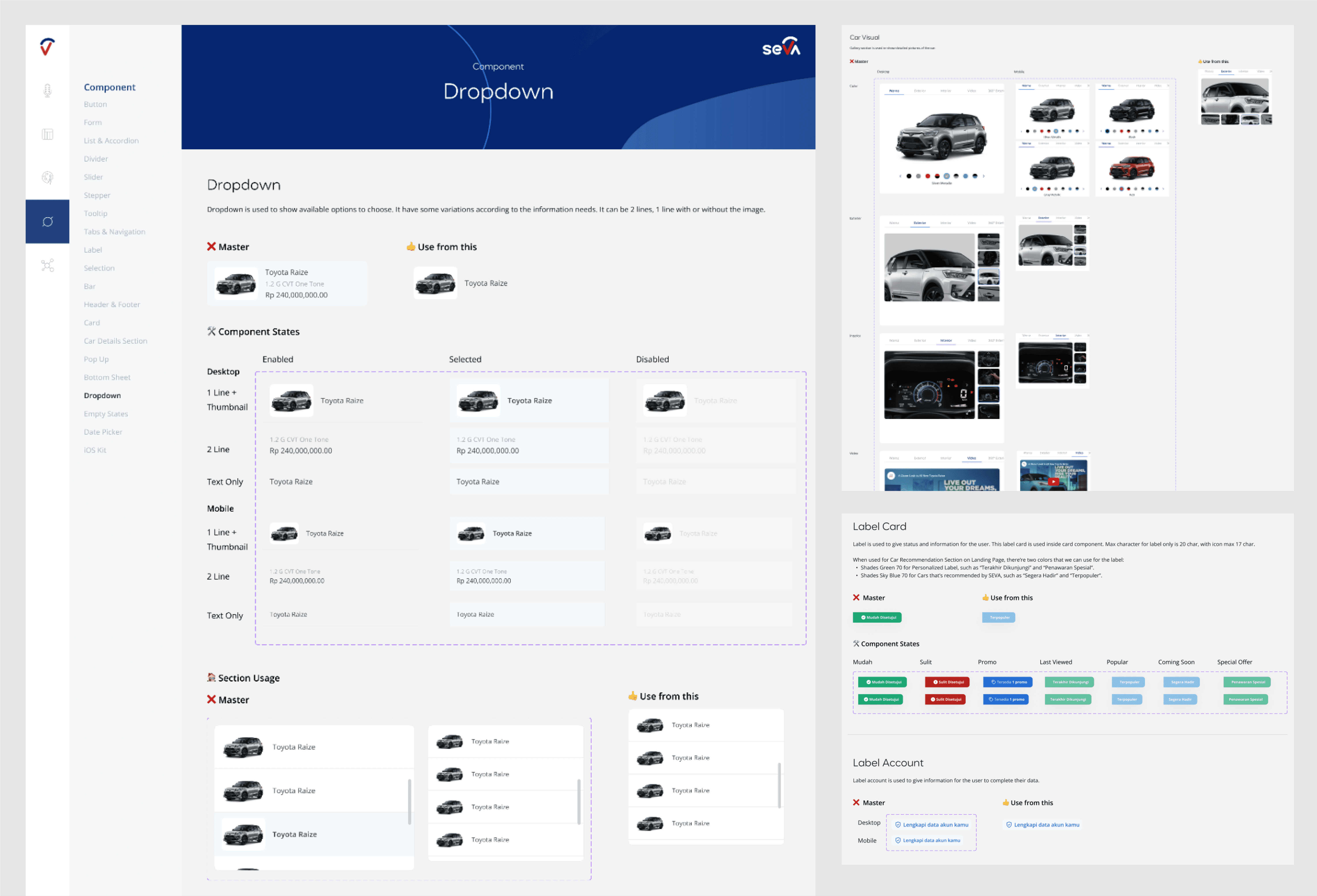
We embraced a clean, finance-meets-lifestyle aesthetic, balancing clarity with emotional appeal.
Neutral tones for trust, with accent colors for action
Card-style listings made cars feel browseable and personal
This project reminded me that clarity beats cleverness. A product that asks users to change behavior must do more than explain; it must guide.
By simplifying the journey and aligning business strategy with user mental models, we unlocked not just better UX, but real, measurable growth.
“A better flow won’t just convert more — it’ll feel right.”