Transforming Healthcare Access for Millions

U by Prodia (UBP) is a digital healthcare solution by Prodia, Indonesia’s largest clinical laboratory, designed to enhance patient access to medical services and serve as Your Personal Health & Wellness Companion. Our goal was to redesign the app, improving its UX/UI to provide a seamless, intuitive, and enjoyable experience for users, ultimately increasing user retention and satisfaction.

As the design lead, I was responsible for reimagining Prodia’s mobile and web ecosystem across three platforms. My goal was to craft intuitive, visually compelling experiences for a broad audience, from legacy users seeking familiarity to new users expecting modern design.

Timeline

Mar 2023 - Oct 2024

Industry

Health Tech

Type

App & Web

Role

UI/UX Project Lead

Team

3 UI/UX Designer

2 Business Analyst

1 Solution Architect

1 Project Manager

21 Engineers

7 QA

3 UI/UX Designer

2 Business Analyst

1 Solution Architect

1 Project Manager

21 Engineers

7 QA

3 UI/UX Designer

2 Business Analyst

1 Solution Architect

1 Project Manager

21 Engineers

7 QA

Challenge

Challenge

Challenge

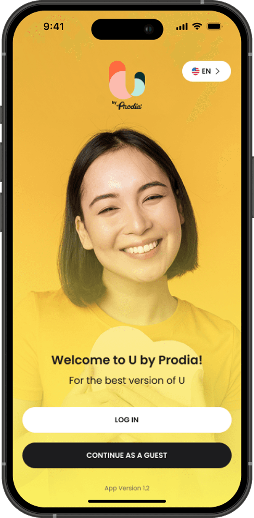
Prodia’s existing mobile experience was aging, both in tech and design. They were sunsetting their legacy app and launching U by Prodia, a modern platform aimed at younger users. But with over a million long-time users (many in older age groups), this transition risked confusion, drop-off, and brand erosion.

At the same time, the team needed to ship rapidly, with ambitious timelines, growing feature scope, and three distinct platforms to support.

Our challenge was threefold:

  1. Help legacy users transition without friction

  2. Deliver a visually modern, trustworthy UI for new users

  3. Maintain consistency and speed across multiple platforms

Our challenge was threefold:

  1. Help legacy users transition without friction

  2. Deliver a visually modern, trustworthy UI for new users

  3. Maintain consistency and speed across multiple platforms

Result

Result

Result

While Prodia is still scaling U by Prodia, our redesign already showed tangible improvements:

While Prodia is still scaling U by Prodia, our redesign already showed tangible improvements:

While Prodia is still scaling U by Prodia, our redesign already showed tangible improvements:

Registration completion improved by 18%

Registration completion improved by 18%

Lab test booking drop-off decreased

Lab test booking drop-off decreased

Design system enabled faster delivery and onboarding

Design system enabled faster delivery and onboarding

MVPs and feature priorities were clarified through strategic workshops

MVPs and feature priorities were clarified through strategic workshops

More than just metrics, we helped Prodia shift from a legacy image to a modern healthcare companion, with a system ready to scale.

More than just metrics, we helped Prodia shift from a legacy image to a modern healthcare companion, with a system ready to scale.

More than just metrics, we helped Prodia shift from a legacy image to a modern healthcare companion, with a system ready to scale.

Approach

Approach

Approach

Designing for Legacy and Future Users

We could not rely on deep user research due to time and access limitations. So, we worked with what we had: funnel data, team insights, and business priorities.

The biggest red flag? Only 28.7% of users who installed the app completed registration, a signal that onboarding friction was driving users away.

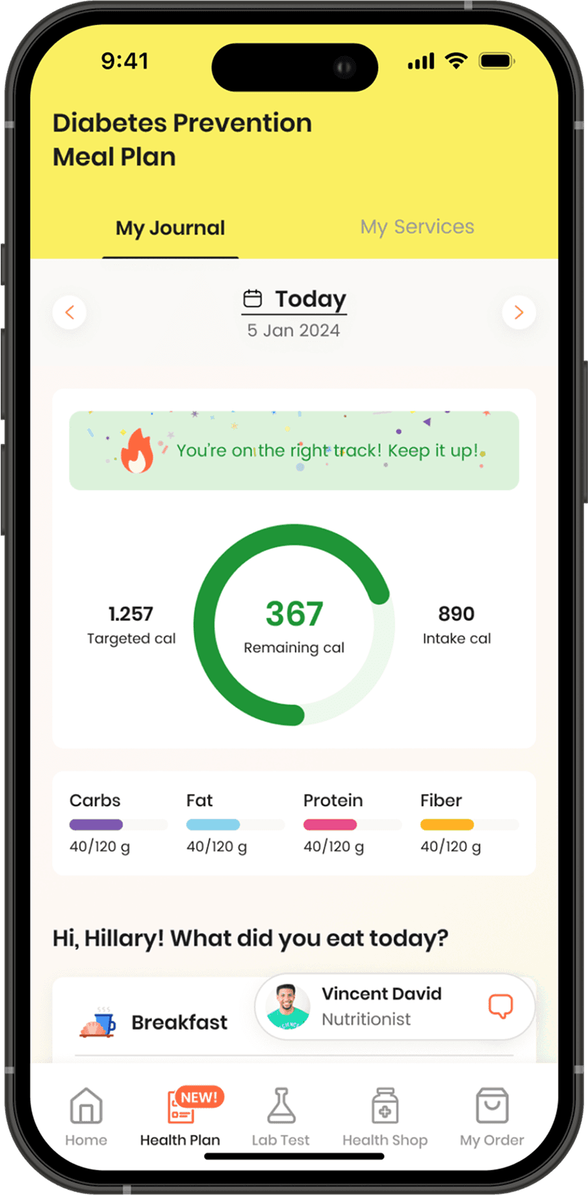
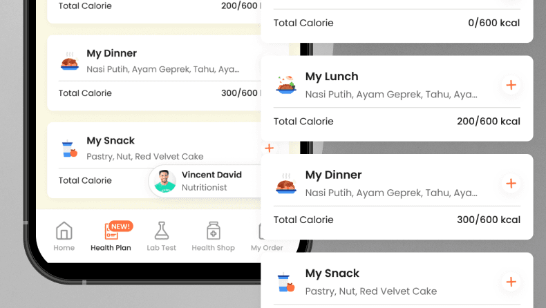
I redesigned the onboarding flow with clear guidance and progressive steps. Key actions like booking tests and viewing results were prioritized on the home screen with simplified navigation and color-coded visuals. Even with limited data, our goal was to build trust through clarity and predictability.

“Make it feel new — but familiar enough not to scare them away.”

Structuring for Speed without Sacrificing Quality

Working with tight timelines across three platforms, we needed a process that allowed for fast pivots without compromising craft.

I co-created a two-phase delivery process with our Business Analyst:

  • Phase 1: Wireframe ideation & early client sign-off

  • Phase 2: High-fidelity design with edge-case coverage

This structure gave us room to explore, validate, and lock in ideas before investing in polish, reducing back-and-forth and late changes.

“We didn’t just move fast — we moved with clarity.”

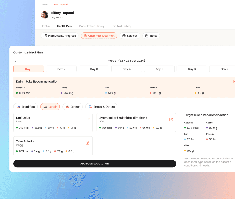
Creating a Cohesive System Across Platforms

Designing for three audiences, patients, doctors/coaches, and admins, came with its own complexity. Each platform had its own behaviors and constraints, yet the brand needed to feel united.

We built a modular design system that scaled across platforms. From spacing rules to color tokens and input behaviors, every element was built to feel consistent while being flexible enough for each platform’s needs.

This system not only improved efficiency, it also helped the newly joined designer onboard faster and contribute to design ops.

Visual Design Highlights

Visual Design Highlights

Visual Design Highlights

This was not just about getting the experience right; it was about making healthcare feel accessible, modern, and trustworthy.

I designed a clean, medically inspired interface with soft contrast, generous spacing, and an intuitive visual hierarchy, all to create a sense of calm and clarity for users navigating their health journeys.

To scale our efforts across three platforms, we built a comprehensive style guide and a reusable component library. This not only ensured consistency across the Patient App, DHC App, and Admin Web, but also laid the foundation for a cohesive and scalable visual system that could evolve with the product.

Reflections

Reflections

This project stretched me in all the best ways, as a designer, a collaborator, and a leader.

Balancing strategy, process, and polish in a high-stakes project showed me how critical early alignment and intentional leadership are. I learned how to scale design thinking across teams, platforms, and constraints, without losing sight of users.

And perhaps most importantly: I saw firsthand how strong visual design amplifies trust, especially in healthcare.

“Good design solves problems. Great design earns trust.”

A special shoutout to my amazing team: Alya & Abianca. Thank you for the collaboration, creativity, and late-night laughs.